Until recently, Nothing had only launched two smartphones, and never has there been so much fuss over Nothing in the mobile industry. The Nothing Phone (1) and Nothing Phone (2) were both hyped more than any other new mobile phone in living memory, and the interest from our readers was palpable. But in the shops, the interest has been more restrained, so Nothing has come up with a new trick: an old favourite called price.
The Nothing Phone (2a), the company’s third smartphone, which Nothing launched at the beginning of March, costs just over half of what you had to pay for the first two phones. We took a look at whether you get as much ‘nothingness’ with the Nothing Phone (2a) as you did with its predecessors.
Design and construction
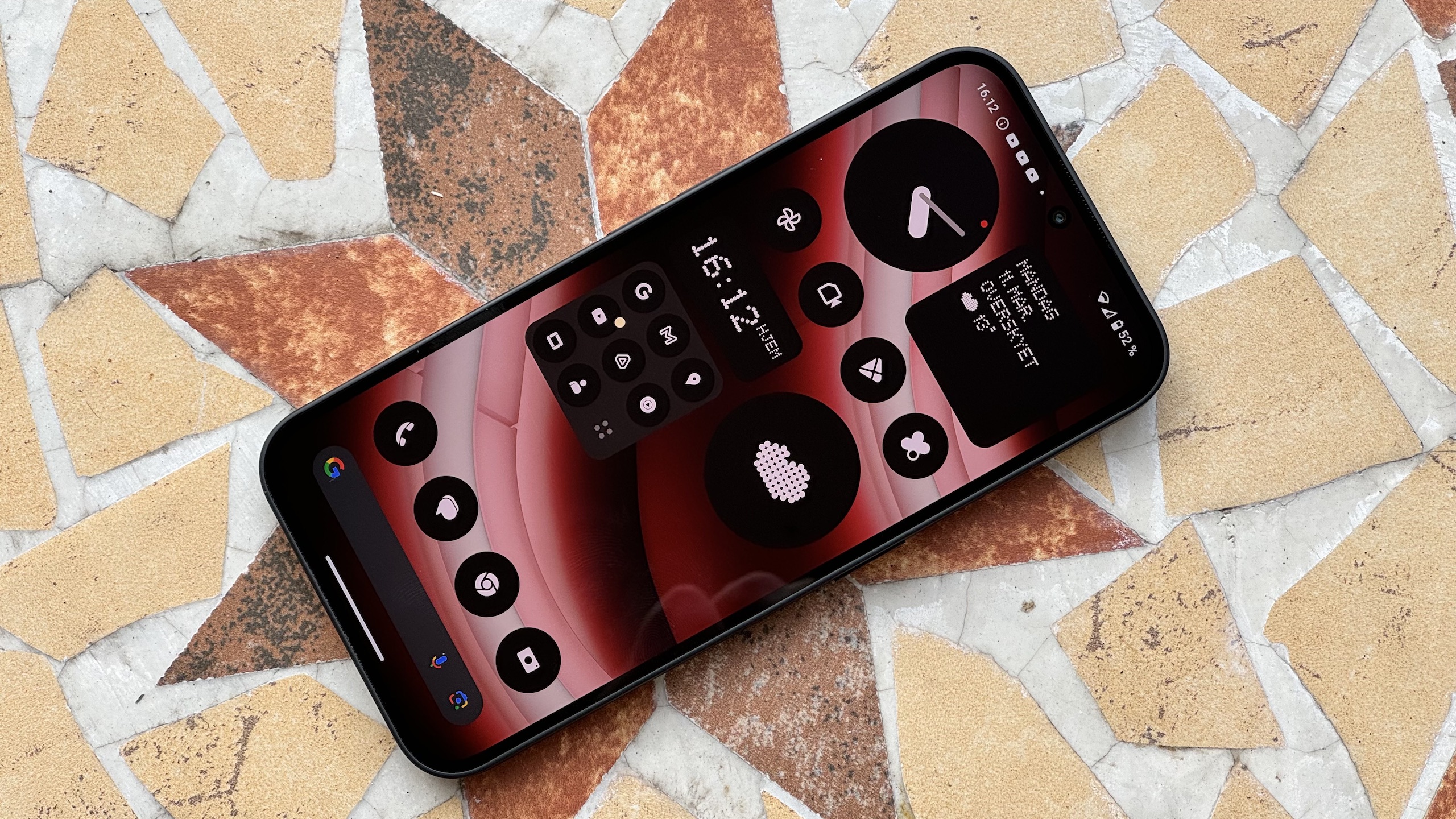
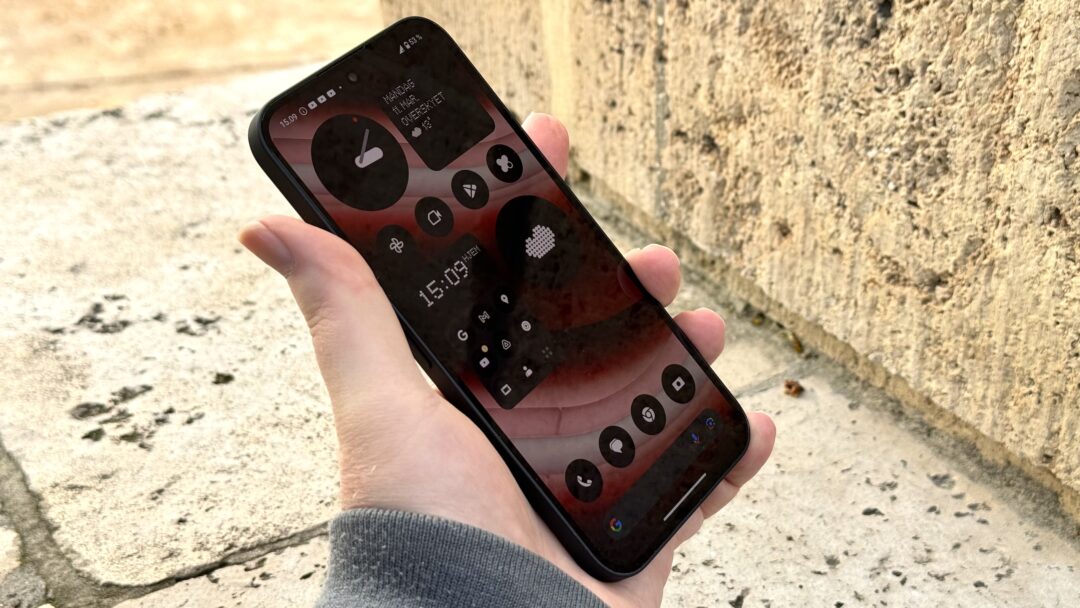
From the front, Nothing Phone (2a) certainly looks like its predecessors. In other words, it looks like an iPhone! The design with the rounded corners and the frame that surrounds the entire phone is certainly … er, inspired by the iPhone’s iconic design. The same goes for the design and placement of the buttons on the phone.
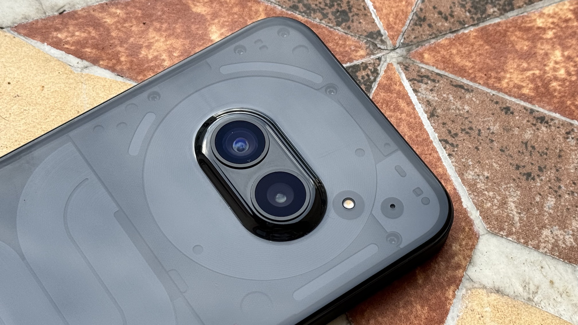
It’s only when you turn the Nothing Phone (2a) over and take a look at the back that it becomes clear that we’re not in Cupertino anymore. The back is made of plastic and blends in with the aluminium frame, but most importantly, it’s transparent, as we know from the two previous Nothing models. Fortunately, it’s not bad at picking up fingerprints.

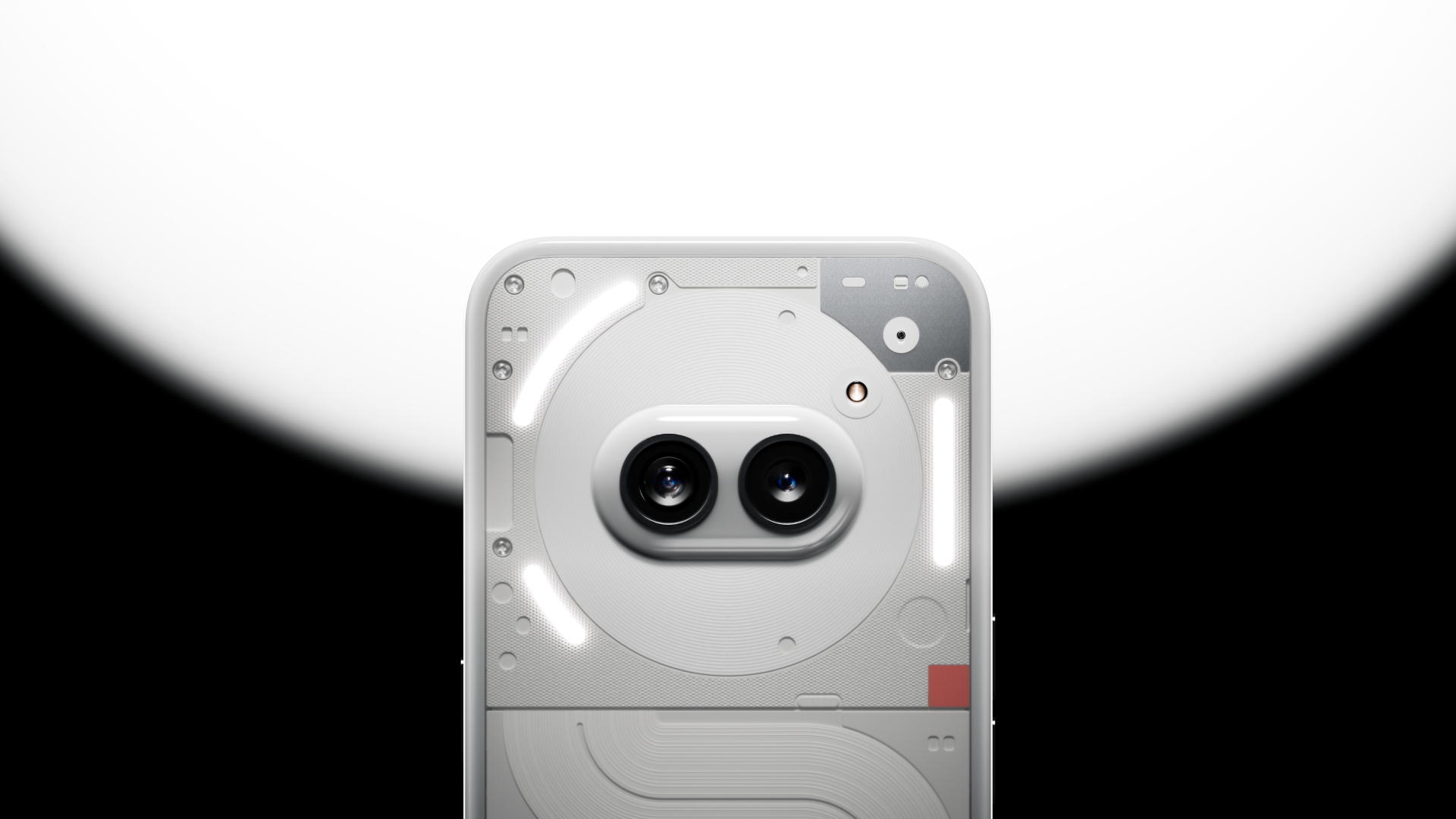
Nothinging’s special Glyph Interface, which the manufacturer launched with the Phone (1), has been retained, but takes up far less space than on previous models, which means that the LED lights – divided into three sections – are only located in the area around the camera.
Rarely has a pair of small wireless earbuds received so much attention as Nothing Ear (1).
The camera module itself consists of two lenses that sit in the centre of the top half of the back, almost like two eyes looking at the person being photographed.
Screen and sound
While the back is slightly curved, the screen is completely flat. And both the screen and the frame around it are completely symmetrical, so there’s an equal distance to the edge of the phone all the way around the screen. It’s a pretty cool and consistent design choice that we can only applaud.
The screen measures 6.7 inches and has a dynamic refresh rate of 30-120 Hz and FHD+ resolution ( 2412 x 1084 pixels). It also has a maximum brightness of 1,300 nits. In other words, it is extremely bright, and the colour reproduction and contrast are absolutely approved when watching videos, for example. The same goes for sound quality.
Camera
There are two cameras: 50 Mp wide-angle and 50 Mp ultra-wide-angle. Nothing promises that images taken with the mobile camera will be as realistic as possible thanks to the algorithms in Nothing’s proprietary TrueLens Engine.

That promise is honoured part of the way. Images taken with the camera are decently sharp with good contrast and true-to-life colour reproduction, and ultra-wide-angle images don’t suffer too much from distortions that could otherwise interfere with the visual impression.
Indoors, a special Glyph Interface feature comes into its own. Instead of using the flash, the camera app allows you to activate all the LED lights on the back to illuminate your subject, giving a softer, more natural light.
Optical zoom, on the other hand, you can forget about. Up to 2x digital zoom is fine, but after that, the result is grainy and almost unusable.
Performance and features
The two things that characterise Nothing mobiles in particular, Glyph Interface and Nothing OS, are also available with the Nothing Phone (2a).
Well, as mentioned earlier, there aren’t quite as many of the small LEDs on the transparent back of the phone, but different ringtones and notification sounds can still play a unique combination of sound, light and vibration when you receive a call or text message.
Best of all, you can also completely switch off ringtones and only use the Glyph Interface to indicate that someone is calling. Because it’s about time someone said out loud that all Nothings ringtones are absolutely horrible!

Glyph Interface can also be used for e.g. visual countdown, and you can create your own little light show when listening to music.
Nothing OS 2.5 is based on Android 14 and has its own design language and aesthetic expression. And there are no superfluous apps either. Fans of a pure Android experience should take a look at the Nothing Phone (2a), as it features an almost minimalistic version of the operating system, almost exclusively with Google’s own apps. The user interface is presented in the very distinctive Nothing OS design, consisting of, among other things, custom fonts and widgets drawn with dots in a black and white colour combination.
Under the screen is a MediaTek Dimensity 7200 Pro processor, while the battery is 5,000 mAh. It can be charged with up to 45 watts, but no charger is included when you buy the phone.

The processor matches the price, but judging from our benchmark tests, the Nothing Phone (2a) is still slightly slower than other smartphones in the same price range. Both the OnePlus Nord 3 5G from 2023 and the Google Pixel 6a from 2022 are still available today and cost the same or less than the Nothing Phone (2a). Yet they both outperform the latest Nothing Phone in the same benchmark tests.
This suggests that Nothing is not as good at getting the most out of the MediaTek processor, although we hasten to emphasise that the phone performs brilliantly on a daily basis and doesn’t get hot, even when pushed with big games and heavy apps.

The battery lasts a long time (13 hours and 3 minutes in our PCMark battery test). And the phone can be charged from 0 to 100 per cent in 59 minutes with a compatible charger. That’s definitely approved.
Conclusion
When a mobile phone costs in the region of €400, you can’t expect to get everything you want. Most smartphones in this price range are pretty boring, and the Nothing Phone (2a) stands out with special features such as the very special Nothing OS user interface and the Glyph Interface, which is unique to Nothing mobiles.
Considered as a smartphone, the Nothing Phone (2a) is definitely worth the price. It is beautifully designed, has a good screen and camera, and the battery life is looooong.
You can buy other smartphones with more power in the same price range, but these are small differences that hardly matter in everyday life.
And compared to its own predecessors, the Nothing Phone (2a) gives you at least as much ‘nothingness’ but costs half as much. Therefore, it might be worth a try if you’ve previously considered buying a Nothing phone but have been put off by the price. Regardless, the Nothing Phone (2a) will be an excellent mid-range mobile phone for most people.

We think
Stylish and robust design with transparent back and Glyph Interface. Beautiful screen with high brightness. The camera takes good and lifelike pictures. Minimalistic Android with unique user interface. Excellent battery life. Not the most impressive performance we've seen. Not even considering the price. The camera lacks optical zoom. The ringtones are awful.
399 €
Specifications
- Operating system: Android 14 + Nothing OS 2.5
- Updates: 3 x Android + 4 years of security
- Display: 6.7″ AMOLED 30-120 Hz, ( 2412 x 1084), 394 ppi
- Processor: MediaTek Dimensity 7200 Pro
- Memory: 12 GB RAM / 256 GB storage
- Camera: 50 Mp f/1.88 w. OIS + 50 Mp 114° f/2.2 ultra wide angle (primary) / 32 Mp f/2.2 (front)
- Wireless: 5G, Wi-Fi 6, Bluetooth 5.3, NFC, GPS, GLONASS, Galileo, BeiDou, QZSS
- Dimensions and weight: 161.74 x 76.32 x 8.55 mm / 190 g
- Battery: 5,000 mAh, 45 W fast charging
- Web: nothing.tech
Benchmarks
- Geekbench 6: 1.112 (single-core), 2.583 (multi-core)
- Geekbench 6 GPU: 3.214
- GFXBench 5.0 Aztec Ruins (high/4K): 30 / 8,9 fps
- AITuTu: 87.211
- AnTuTu 10: 685.548
- 3DMark Wild Life Extreme: 1.155
- PCMark Work 3.0: 12.321
- Browserbench Speedometer 3: 7,45
- Battery: 13:03 hours

